Plotting x-y data: associations

Author

Jeffrey R. Stevens

Published

April 17, 2023

  1. Using the mpg data, create a scatterplot of the highway fuel efficiency and city fuel efficiency.
library(tidyverse)
── Attaching core tidyverse packages ──────────────────────── tidyverse 2.0.0 ──
✔ dplyr     1.1.4     ✔ readr     2.1.5
✔ forcats   1.0.0     ✔ stringr   1.5.1
✔ ggplot2   3.5.0     ✔ tibble    3.2.1
✔ lubridate 1.9.3     ✔ tidyr     1.3.1
✔ purrr     1.0.2     
── Conflicts ────────────────────────────────────────── tidyverse_conflicts() ──
✖ dplyr::filter() masks stats::filter()
✖ dplyr::lag()    masks stats::lag()
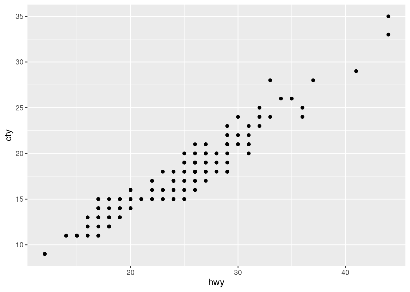
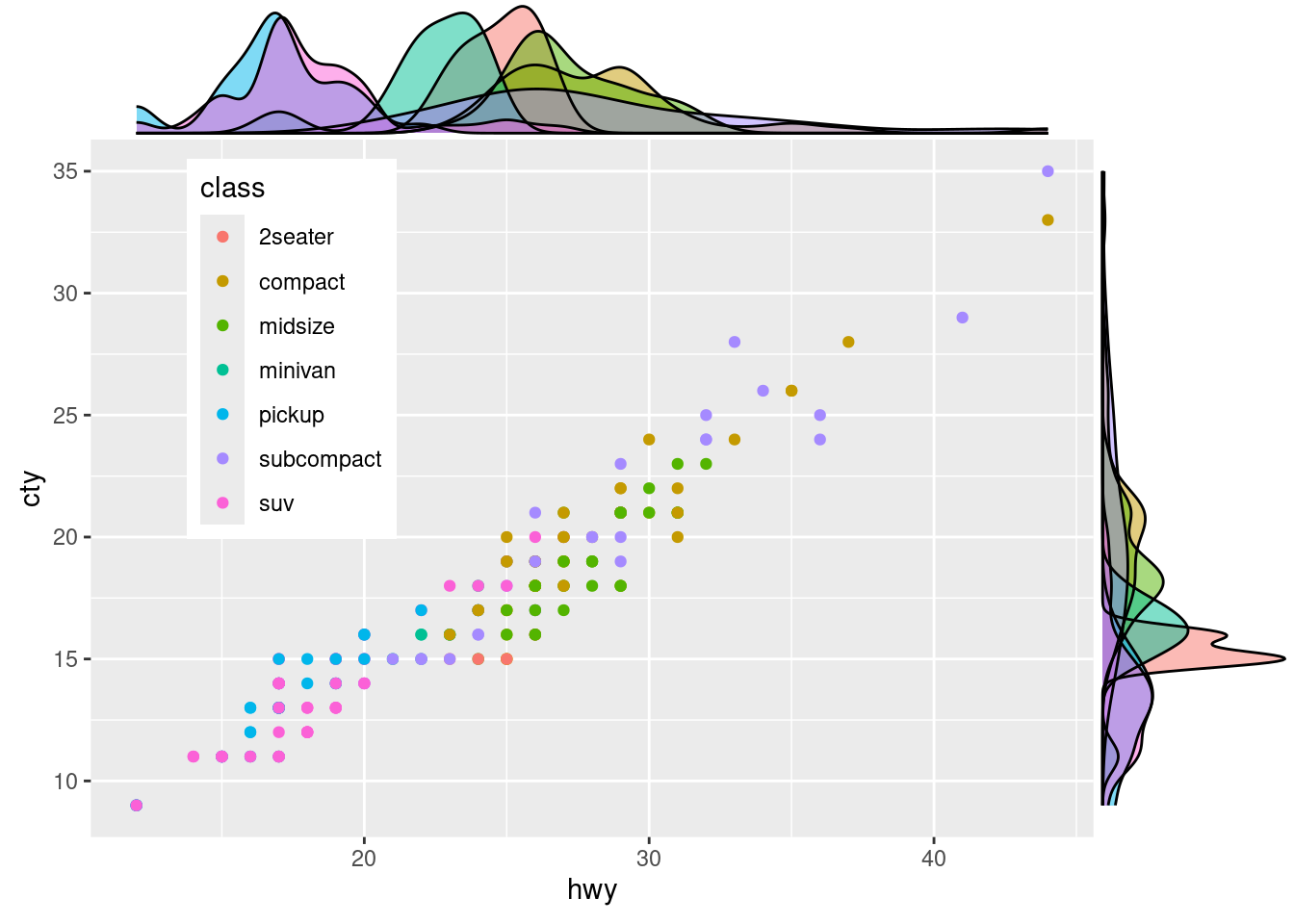
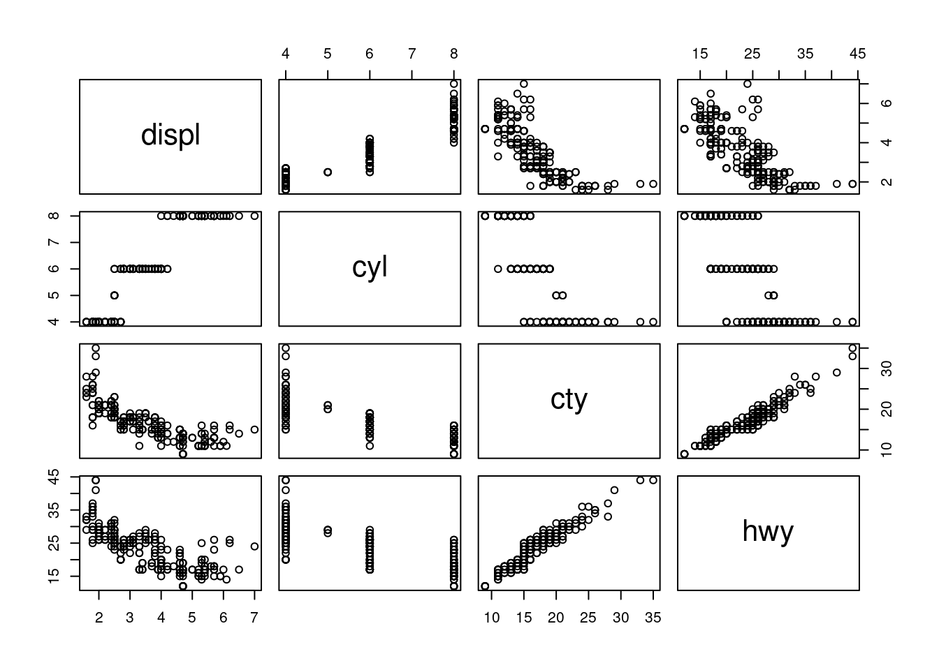
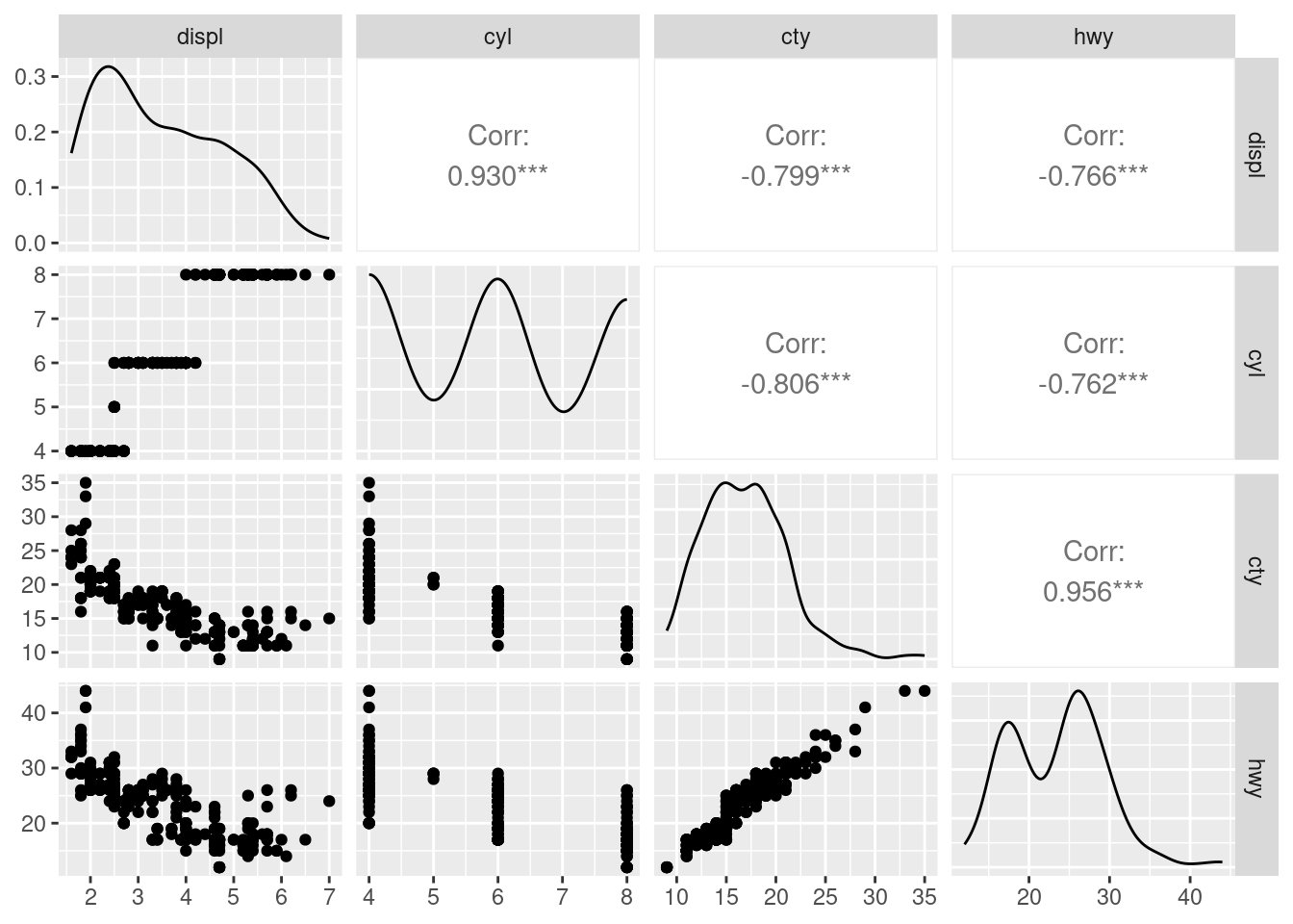
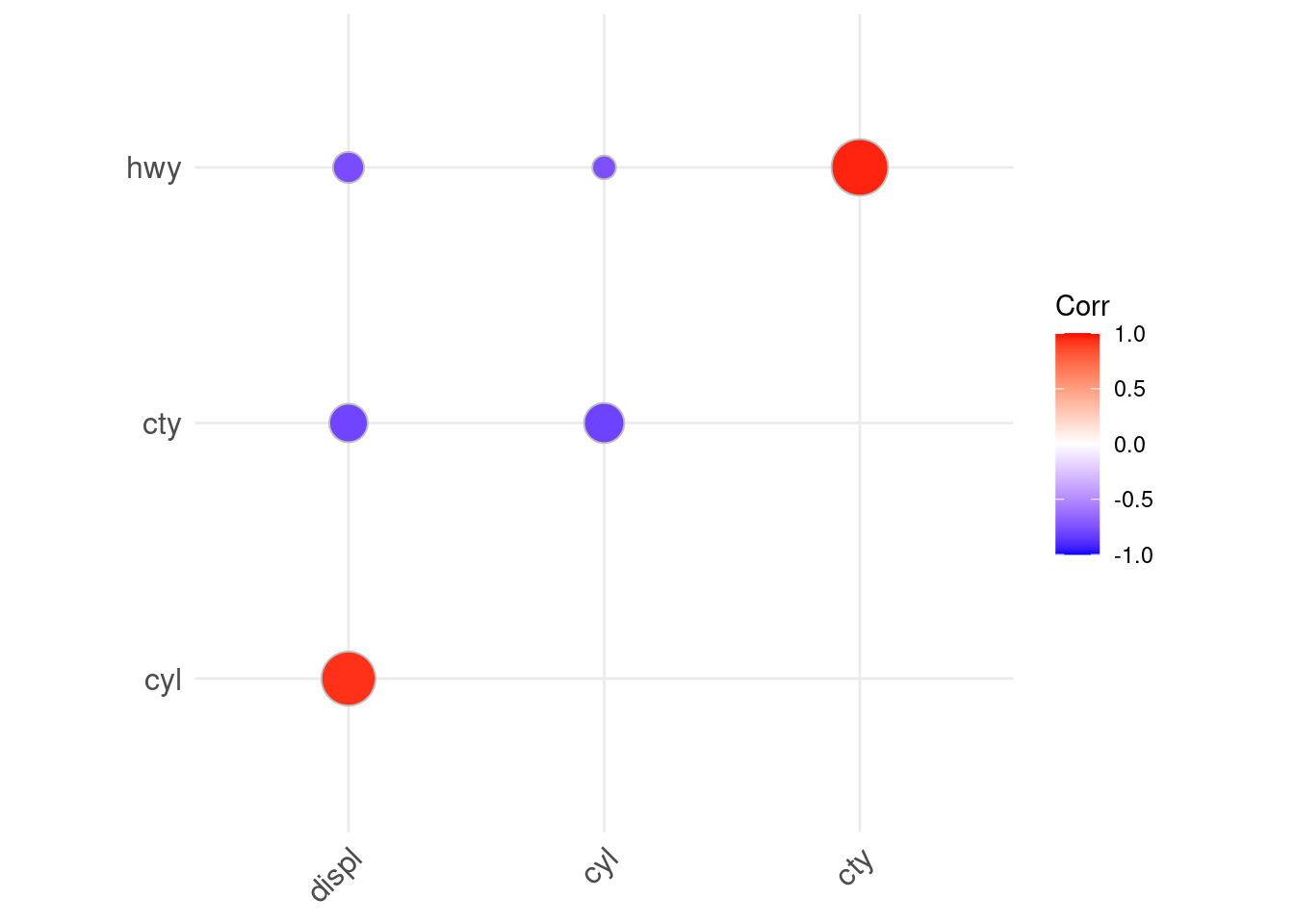
ℹ Use the conflicted package (<http://conflicted.r-lib.org/>) to force all conflicts to become errors
mpg |> 
  ggplot(aes(x = hwy, y = cty)) +
  geom_point()

  1. Now add a dashed reference line showing equivalent values for the two axes and set the aspect ratio to 1.
mpg |> 
  ggplot(aes(x = hwy, y = cty)) +
  geom_abline(slope = 1, intercept = 0, linetype = "dashed")+
  geom_point() +
  theme(aspect.ratio = 1)

  1. Looks like there is a possibility of overplotting. Turn this into a bubble chart with dot size scaling to the number of data points for each dot and make the dot colors steelblue.
mpg |> 
  ggplot(aes(x = hwy, y = cty)) +
  geom_count(color = "steelblue")

  1. Add rugs to scatterplot #1 and change to minimal theme.
mpg |> 
  ggplot(aes(x = hwy, y = cty)) +
  geom_point() +
  geom_rug() +
  theme_minimal()

  1. From scatterplot #1, color the dots by class, move the legend to the top left corner of the plot, and add marginal density plots.
library(ggExtra)
class_plot <- mpg |> 
  ggplot(aes(x = hwy, y = cty, color = class)) +
  geom_point() +
  theme(legend.position = c(0.2, 0.7))
Warning: A numeric `legend.position` argument in `theme()` was deprecated in ggplot2
3.5.0.
ℹ Please use the `legend.position.inside` argument of `theme()` instead.
ggMarginal(class_plot, type = "density", groupFill = TRUE)

  1. Create a data frame called mpg_num that only includes variables with numeric values using the where() function. Then remove the year column.
mpg_num <- mpg |> 
  select(where(is.numeric)) |> 
  select(!year)
  1. Create correlation plots of the numeric variables in mpg_num in both base R and using {GGally}’s ggpairs() function.
pairs(mpg_num)

library(GGally)
Registered S3 method overwritten by 'GGally':
  method from   
  +.gg   ggplot2
ggpairs(mpg_num)

  1. Create a correlation matrix of mpg_num with the cor() function. Then use ggcorrplot() from the {ggcorrplot} package to make a heatmap correlation plot with just the upper triangle of the matrix and using circles to represent correlation coefficient magnitude.
library(ggcorrplot)
mpg_num |> 
  cor() |> 
  ggcorrplot(type = "upper", method = "circle")